Friday 6 July 2012

Conclusion

This is it...hope I made it to tutor`s good books and I get my Diploma with willing results.


As I mentioned before my main picture went for college exhibition in our town hall, what made me more proud along with my capture of the moon ( best as I could).


  Some pic`s from this event...


I like to thank you my little girl Mercedes who helped realize my ideas and share them with you. She was brilliant and very very patient.


Also my dear friend Ian to let me climb to he`s family house loft and opportunity to take beautiful diorama images. 


Two years past, I learn a lot, more myself, and lots more to learn. Some of my future plans consist to make other photography related blog, what I`ll will set up together with my dear fiend, to continue journey together.
So as,  will start working on my portfolio and fingers crossed, maybe another two years will past and I`ll will be doing what I dreaming about - working in photo industry.!?

Kids in Studio - Health and safety

Anyone who takes children to the studio, want them to have a fun time.  

A photography studio is potentially a dangerous place for little ones.  Whilst you make things as safe as possible, a few simple rules have to be fallowed to ensure all visiting kids health and safety, that they can enjoy their portrait photography experience.

  • -Shoes off – generally applies to everyone really, helping keep the floor clean for the next clients’ appointment.
  • - No running around the studio.  Lots of hazards can occur, it`s easy to slip, trip over something and not even damage equipment but seriously hurt themselves.
  • - No food or drinks, as things can get really messy and could all photos shoot just waste of time.
Jumping around and playing, under supervision, within the designated area is fine of course.  

So anyone who thinks that kids it’s their thing and want to set up a studio, you have to make sure, you`ll do everything possible to make children feel comfortable and happy, so as parents.

Tuesday 3 July 2012

305 vs 215

1. Taken in studio with Canon EOS 5D.

F-Stop :          f/8
Exposure :      1/125sec
ISO :              100


Original image was mainly manipulated using Photo Shop: cropped, adjusted light balance, also photo filter and distort filters used.

After that I used HP Media Smart Photo programme to add final touches, make image suitable for opening scene.


First image I wanted to create in a bit romantic mood, making light soft and warm. Main personage is sweet innocent girl, what gladly played and transformed into my daughter. She`s not afraid from the world, just want to be loved not understand...

2. Taken in studio with Canon EOS 5D.

F-Stop :          f/8
Exposure :      1/125sec
ISO :              100

Same as first taken in college studio. Cropped to appropriate size to cover unperfections of studio walls. Adjusted in Photo Shop to please me. More or less with a right colour balance. Some artistic filters used and removed spots wit filling tool.
 

 HP Smart help me out with some Auto tools (see image below) and other effect tools. Specially Vignette tool to add a different mood to picture.


Second image speaks for itself, as things not looking good for the little girl  and with sadness rises darkness...

3. Fallowing photograph is made from two images using layer tool in Photo Shop.

- First taken in studio with Canon EOS 5D.
F-Stop :          f/8
Exposure :      1/125sec
ISO :              100

- Second is photo from my this years 366 project taken one misty spring morning in local park using my old simple Samsung camera and then obviously manipulated using Photo Shop.

Original main Image was also retouched, coped and stylized colour balance. Then both images was placed together creating more or less realistic feel as she really walking into woods.

Unfortunately I didn't manage to upload HP Media snap capture, but I used this program to ad some final touches as well. Sharpness and Vignette. Some how server rejected to upload it.


Story continues as girl is left all alone, all rejected and unhappy, she finds she`s way into the woods...


4.Taken in studio with Canon EOS 5D.

F-Stop :          f/8
Exposure :      1/125sec
ISO :              100
(for the main pic)

Same as above made from two images together. The only background which I didn't took myself but find in the internet. Some image showing well up till the bottom. I couldn't find my self any well, so I hope you will forgive me. I change it a bit filling the well bottom part as you cant see the water, just blackness, it suited me more creating my photograph.

Studio image also was corrected, as it anyway was one part of my assignment 215.

Both images was cropped to fit each other and also added mainly to my photograph Photo shop effects as channel mixer- what helped me to get right shade of the face and also artistic filter to rise a contrast.


HP Media was used to add sharpness and Vignette.

Little girl end up in very dark place, with no escape....


5.Same studio with Canon EOS 5D.

F-Stop :          f/8
Exposure :      1/125sec
ISO :              100
(for the main pic)

 Very similar to one above as same background used again just different main image and also created a different feel. Its not in colour any more as mood of the story changes for worst.

Layers, photo filters and artistic filters used to create very similar image that previous adding more character.


Girl is waking up from the sleep ... in the eyes you can notice sadness slowly changing for anger...


6. Taken by my Nikon D3000 in my bathroom.

F-Stop :          f/5
Exposure :      1/30sec
ISO :              400

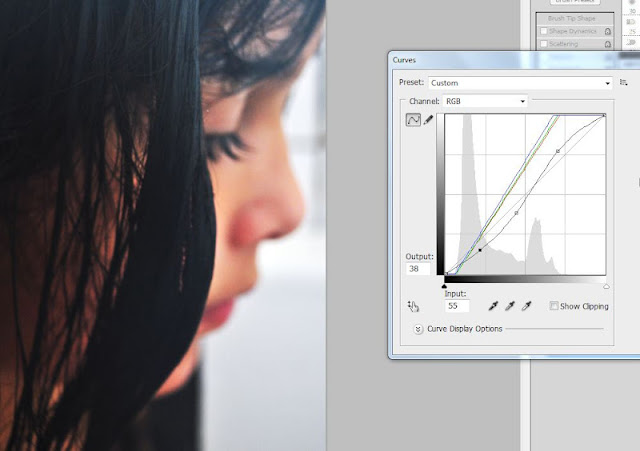
Moment was perfect so I thought I can used. Was struggling with poor light, so ISO went up to 400, also all steam from hot water wasn't helping, but in the end was done best and I think is not a bad photograph.

Curves was first tool I used, to get right colour balance.


Then I converted image to black & white, as it suit the mood better. Was filled in some unperfections and artistic filter applied.

On HP Media some other effects was used. mainly sharpness, contrast and soft focus.


With this photograph I wanted to represent and show little girls big sadness over the world:...."I`m cold but still alive."


7. Other studio photograph, was taken with same Canon EOS 5D.

F-Stop :          f/8
Exposure :      1/125sec
ISO :              100
(for the main pic)

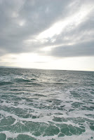
Background is one of the last years Cornwall visits stock photos.

Images again was cropped to fit each other. Was very  glad that my main photograph was taken in studio as with a white background. That help me - unskilled Photo shop user create that kind water effect you can see in main picture. Mostly done experimenting with layers.

For some reason I didn't manage upload my HP Media screen grab. Blogsite just sometimes don't like my pictures...But also with HP software help same effects was used to create more needed look.

Water suited the best as tape was sprayed in studio to make it look as wet, so all together I done my best to create a really wet image.

...As little girl is risen, with all she`s anger in mind she wants to send world a message...


8. Taken by my camera Nikon D3000 in college along the corridor.
F-Stop :          f/7.1
Exposure :      1/13sec
ISO :              400

ISO rise high as I didn't have good lightening.  It`s one of the college`s corners, suited me better than studio.
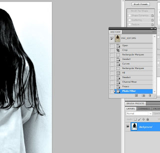
In Photo Shop picture was cropped,  had adjusted colour balance, applied artistic and photo filters.
All that give a mystery to whole image, as you can see even hair from first glance looks wet exactly how I wanted.
There comes the part - what more or less start reminding me about film The Ring - the main inspiration of all my theme.

For same reason my blogger page don't want to accept some of HP Media snap captures, but I used this program as well as you can see Vignette effect was applied.

Little person is nearly changes to an evil spirit and waiting to come back to real world, but not as sweet as before..

7. Studio photograph by  Canon EOS 5D.
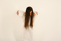
F-Stop :          f/8
Exposure :      1/125sec
ISO :              100
(for the main pic)
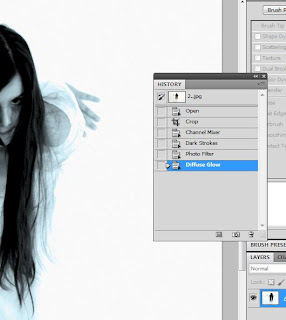
 Also combination of two images together. One, the main one, taken in studio, background as one of the previous pictures is from my 366 project.

Both pictures was cropped and manipulated using photo shop. Probably one of the photographs, what took me the most time to create in order to get willing result. You can see what exactly I talking about. I wanted to show and somehow create little girls spirit entering our world. In the film probably its most scariest scene, but unfortunately I haven had enough skills to do better, I tried my best and pleased with results.

Apart from cropping, was lots of filter adding, colour changing and again filter applying, till I was satisfied.


...she`s coming back, so be afraid....


7. Studio, same Canon EOS 5D.

F-Stop :          f/8
Exposure :      1/125sec
ISO :              100

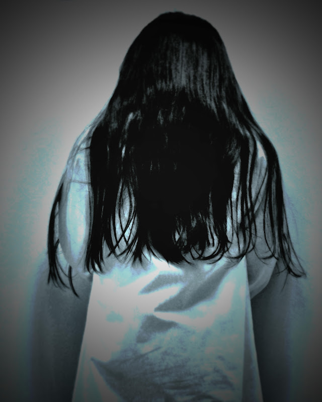
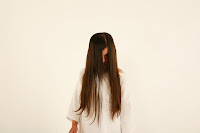
My favourite...and I thing the best one from all lot. Didn't take much time to so it. Mainly was made during last lesson in college. Didn't have the main manipulations screen grab, bet have some fallowing when final touches was added In Photo shop and using HP Media Smart Photo.

As you can easily see main original is very very different from the final image. I am really delighted that I manage to make the final right how you see it now, as final look of the person was most important part of all.

I used to this picture for colleges annual exhibition, but change it slightly for final of my theme.

In order to get she`s hair darker not changing the brightness of the face I use a lasso tool what let me apply other filter only to the hair without retouching face. Manage to do that after I add fnal touches with my HP Media.

That was the probably only image that completely satisfied me, as all was meant to bee in that kind a style, just I run out of time waiting for better weather conditions for shooting outdoors, into woods and fields.


I call this image ..No escape... I if you ever saw the film you know what I meant, as no more sweet girl left....


All photographs was cropped to 16in by 20in, to make them all same size, as its more or less essential when you trying to include them in one theme. Also - even if some is a bit in colour, some black and white and on some applied cyan filter all is joined with vignette edges, what makes it all belong to one picture story, which I done my best to create considering my skills in portrait photography and Photo Shop.

Samara vs Mersedesa (final 10)